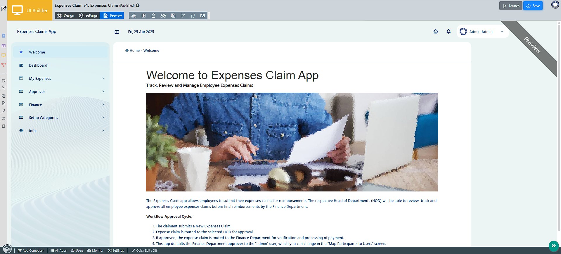
Introduction
The DX 8 Trimeda Theme is a flexible and modern interface theme, now enhanced to reflect the sleek design and seamless functionality of the Joget theme. It offers extensive customization options, enabling users to personalize their experience while delivering a cohesive and contemporary aesthetic.
Configure DX 8 trimeda
To set up a theme DX 8 Trimeda, go to the Theme field in UI settings > Configure Layout and select DX 8 Trimeda.
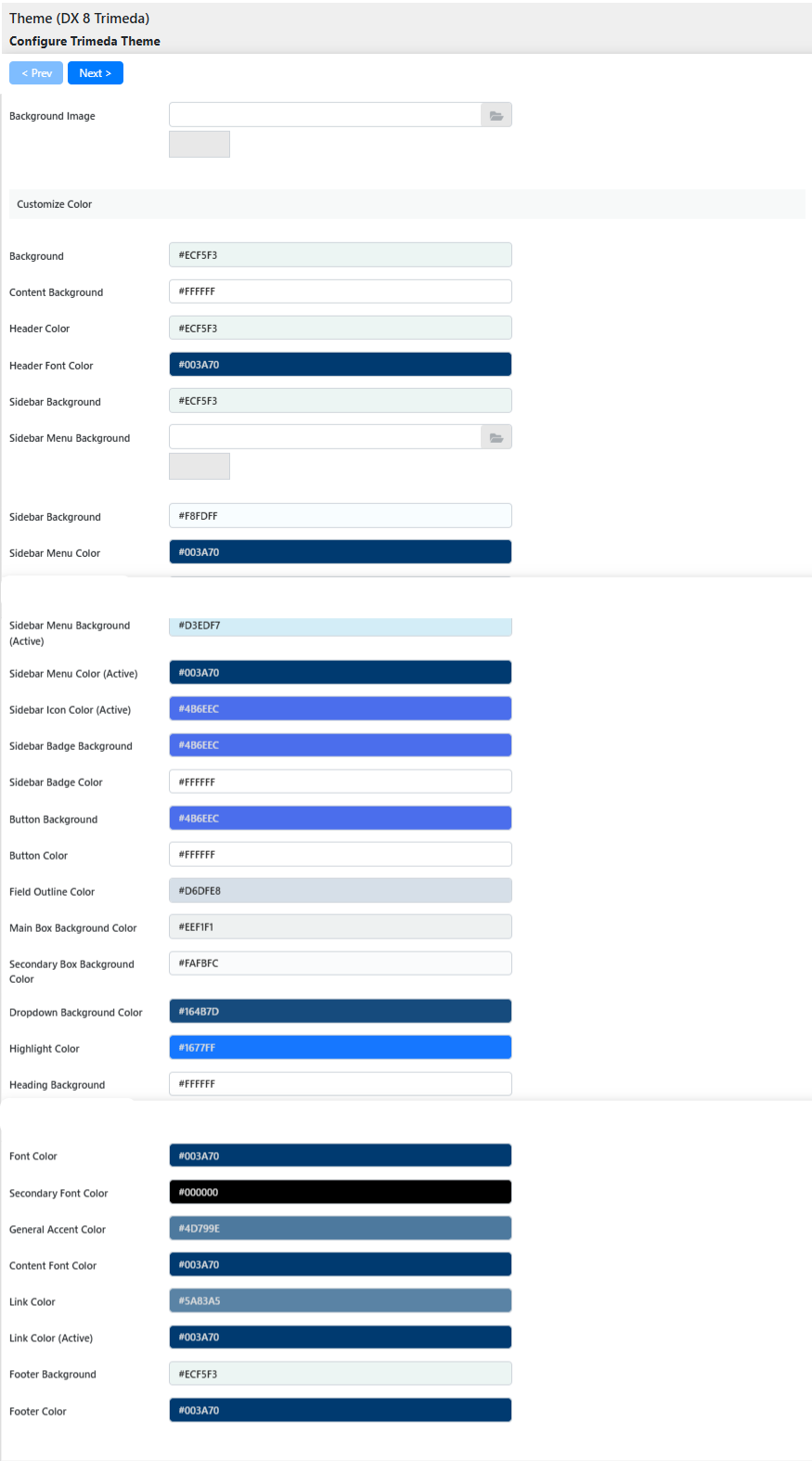
When you select DX 8 Trimeda, you will see the following properties available for configuration:
- Menu Position:
Determines the position of the menu- Side Menu
- Minimized Side Menu
- Horizontal Menu below Header
- Horizontal Menu inline with Header
- No Menu
- Background Image: Upload a custom background image for a personalized look.
- Background:
Color Scheme-Background.
You can choose from the preset colors or custom colors. If you choose custom colors, you can define them manually or through the color picker. - Content Background:
Color Scheme-Content Background.
You can choose from the preset colors or custom colors. If you choose custom colors, you can define them manually or through the color picker. - Header Color:
Color Scheme-Header Color.
You can choose from the preset colors or custom colors. If you choose custom colors, you can define them manually or through the color picker. - Header Font Color:
Color Scheme-Header Font Color.
You can choose from the preset colors or custom colors. If you choose custom colors, you can define them manually or through the color picker. - Sidebar Background:
Color Scheme-Sidebar Background.
You can choose from the preset colors or custom colors. If you choose custom colors, you can define them manually or through the color picker. - Sidebar Menu Background:
Color Scheme-Sidebar Menu Background.
You can choose from the preset colors or custom colors. When you choose custom colors, you can define the color manually or through the color picker. - Sidebar Menu Color:
Color Scheme-Sidebar Menu Color.
You can choose from the preset colors or custom colors. When you choose custom colors, you can define the color manually or through the color picker. - Sidebar Icon Color:
Color Scheme-Sidebar Icon Color.
You can choose from the preset colors or custom colors. When you choose custom colors, you can define the color manually or through the color picker. - Sidebar Menu Background (Active):
Color Scheme-Sidebar Menu Background (Active).
You can choose from the preset colors or custom colors. When you choose custom colors, you can define the color manually or through the color picker. - Sidebar Menu Color (Active):
Color Scheme-Sidebar Menu Color (Active).
You can choose from the preset colors or custom colors. When you choose custom colors, you can define the color manually or through the color picker. - Sidebar Icon Color (Active):
Color Scheme-Sidebar Icon Color (Active).
You can choose from the preset colors or custom colors. When you choose custom colors, you can define the color manually or through the color picker. - Sidebar Badge Background:
Color Scheme-Sidebar Badge Background.
You can choose from the preset colors or custom colors. When you choose custom colors, you can define the color manually or through the color picker. - Sidebar Badge Color:
Color Scheme-Sidebar Badge Color.
You can choose from the preset colors or custom colors. When you choose custom colors, you can define the color manually or through the color picker. - Button Background:
Color Scheme-Button Background.
You can choose from the preset colors or custom colors. When you choose custom colors, you can define the color manually or through the color picker. - Button Color:
Color Scheme-Button Color.
You can choose from the preset colors or custom colors. When you choose custom colors, you can define the color manually or through the color picker. - Field Outline Color:
Define borders or outlines surrounding user input fields. Options include preset palettes or custom definitions. - Main Box Background Color:
Control the primary background area or container with either default palettes or custom tones, leveraging the color picker tool. - Secondary Box Background Color:
Enhance complementary areas (i.e., sub-sections) with designated secondary background hues; presets or manual input applies. - Dropdown Background Color:
Control menu dropdowns with the preferred tones: preset styles or customizable picker-entry defined. - Highlight Color:
Color Scheme-Highlight Color.
You can choose from the preset colors or custom colors. When you select custom colors, you can define the color manually or through the color picker. - Highlight Background:
Color Scheme-Highlight Background.
You can choose from the preset colors or custom colors. When you select custom colors, you can define the color manually or through the color picker. - Heading Font Color:
Color Scheme-Heading Font Color.
You can choose from the preset colors or custom colors. When you choose custom colors, you can define the color manually or through the color picker. - Font Color:
Color Scheme-Font Color.
You can choose from the preset colors or custom colors. When you choose custom colors, you can define the color manually or through the color picker. - Secondary Font Color:
Color Scheme-Secondary Font Color.
Defines the color of supporting text elements or secondary information. Choose from preset options or customize manually with the color picker.
- General Accent Color:
Color Scheme-General Accent Color.
This sets the accent hue for key interface highlights, such as borders, buttons, or icons, providing a cohesive design. Select from preset color schemes or personalize using the color picker.
- Content Font Color:
Color Scheme-Content Font Color.
You can choose from the preset colors or custom colors. When you choose custom colors, you can define the color manually or through the color picker. - Link Color:
Color Scheme-Link Color.
You can choose from the preset colors or custom colors. When you choose custom colors, you can define the color manually or through the color picker. - Link Color (Active):
Color Scheme-Link Color (Active).
You can choose from the preset colors or custom colors. When you choose custom colors, you can define the color manually or through the color picker. - Footer Background:
Color Scheme-Footer Background.
You can choose from the preset colors or custom colors. When you choose custom colors, you can define the color manually or through the color picker. - Footer Color:
Color Scheme-Footer Color.
You can choose from the preset colors or custom colors. When you choose custom colors, you can define the color manually or through the color picker.
Here’s your information in a neatly structured table:
| Feature | Description |
|---|
| Menu Position | Determines the menu position: Side Menu, Minimized Side Menu, Horizontal Menu (below or inline with Header), No Menu |
| Background Image | Upload a custom background image for a personalized look |
| Background | Color Scheme - Background; Choose preset or custom colors via manual input or color picker |
| Content Background | Color Scheme - Content Background; Choose preset or custom colors via manual input or color picker |
| Header Color | Color Scheme - Header Color; Choose preset or custom colors via manual input or color picker |
| Header Font Color | Color Scheme - Header Font Color; Choose preset or custom colors via manual input or color picker |
| Sidebar Background | Color Scheme - Sidebar Background; Choose preset or custom colors via manual input or color picker |
| Sidebar Menu Background | Color Scheme - Sidebar Menu Background; Choose preset or custom colors via manual input or color picker |
| Sidebar Menu Color | Color Scheme - Sidebar Menu Color; Choose preset or custom colors via manual input or color picker |
| Sidebar Icon Color | Color Scheme - Sidebar Icon Color; Choose preset or custom colors via manual input or color picker |
| Sidebar Menu Background (Active) | Color Scheme - Sidebar Menu Background (Active); Choose preset or custom colors via manual input or color picker |
| Sidebar Menu Color (Active) | Color Scheme - Sidebar Menu Color (Active); Choose preset or custom colors via manual input or color picker |
| Sidebar Icon Color (Active) | Color Scheme - Sidebar Icon Color (Active); Choose preset or custom colors via manual input or color picker |
| Sidebar Badge Background | Color Scheme - Sidebar Badge Background; Choose preset or custom colors via manual input or color picker |
| Sidebar Badge Color | Color Scheme - Sidebar Badge Color; Choose preset or custom colors via manual input or color picker |
| Button Background | Color Scheme - Button Background; Choose preset or custom colors via manual input or color picker |
| Button Color | Color Scheme - Button Color; Choose preset or custom colors via manual input or color picker |
| Field Outline Color | Define borders or outlines for input fields; Choose preset or custom colors |
| Main Box Background Color | Set primary container background; Choose preset or custom colors |
| Secondary Box Background Color | Define background for sub-sections; Choose preset or custom colors |
| Dropdown Background Color | Set menu dropdown background; Choose preset or custom colors |
| Highlight Color | Color Scheme - Highlight Color; Choose preset or custom colors via manual input or color picker |
| Highlight Background | Color Scheme - Highlight Background; Choose preset or custom colors via manual input or color picker |
| Heading Font Color | Color Scheme - Heading Font Color; Choose preset or custom colors via manual input or color picker |
| Font Color | Color Scheme - Font Color; Choose preset or custom colors via manual input or color picker |
| Secondary Font Color | Defines the color for supporting text; Choose preset or custom colors |
| General Accent Color | Color Scheme - General Accent Color; Sets accent hue for borders, buttons, icons |
| Content Font Color | Color Scheme - Content Font Color; Choose preset or custom colors via manual input or color picker |
| Link Color | Color Scheme - Link Color; Choose preset or custom colors via manual input or color picker |
| Link Color (Active) | Color Scheme - Link Color (Active); Choose preset or custom colors via manual input or color picker |
| Footer Background | Color Scheme - Footer Background; Choose preset or custom colors via manual input or color picker |
| Footer Color | Color Scheme - Footer Color; Choose preset or custom colors via manual input or color picker |
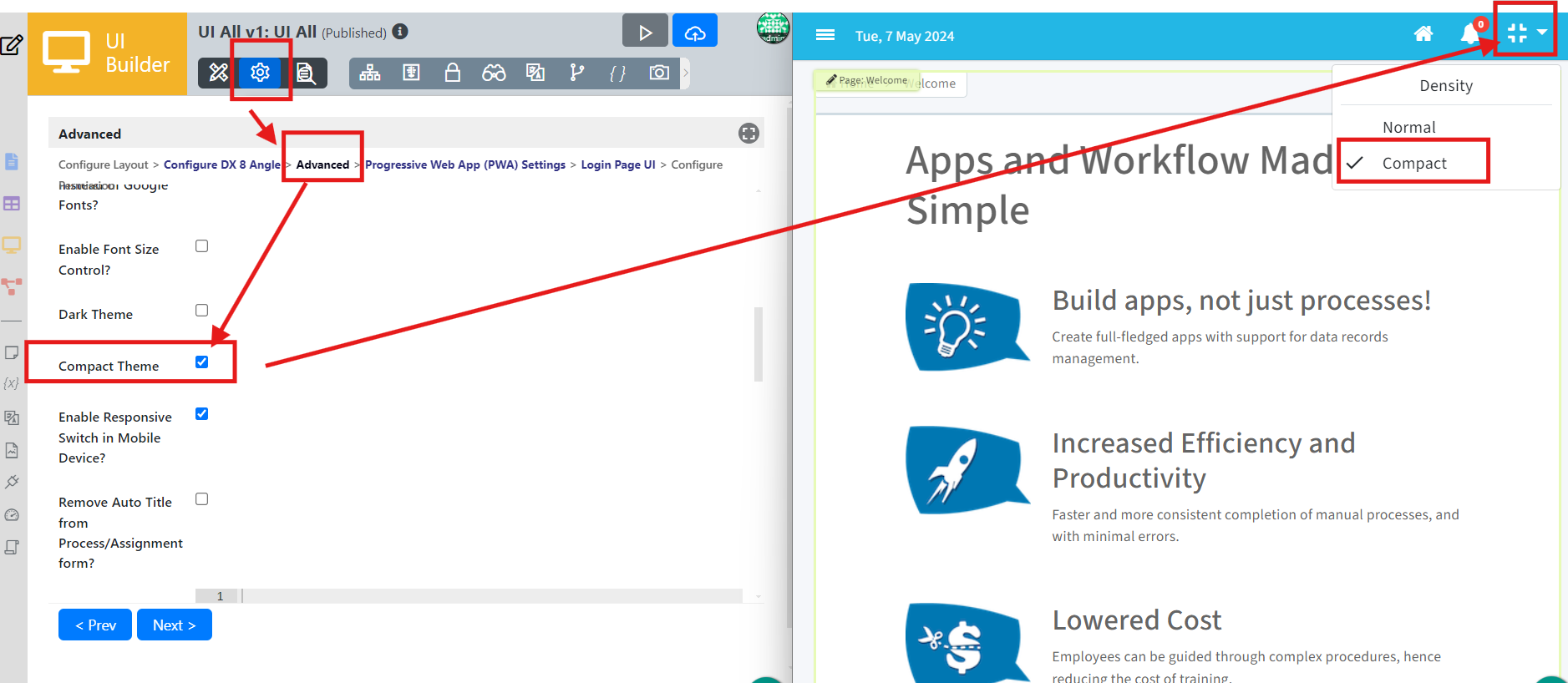
Advanced
The Advanced settings offer extensive customization for the DX 8 Trimeda Theme. You can define URLs for the favicon and logo, disable user profile photos, and configure the inbox for assignments. Additional features include enabling font size control, dark theme, responsive switch for mobile devices, and adding custom CSS or JavaScript. You can also insert HTML for subheaders, subfooters, and a home banner, and manage user menu shortcuts.
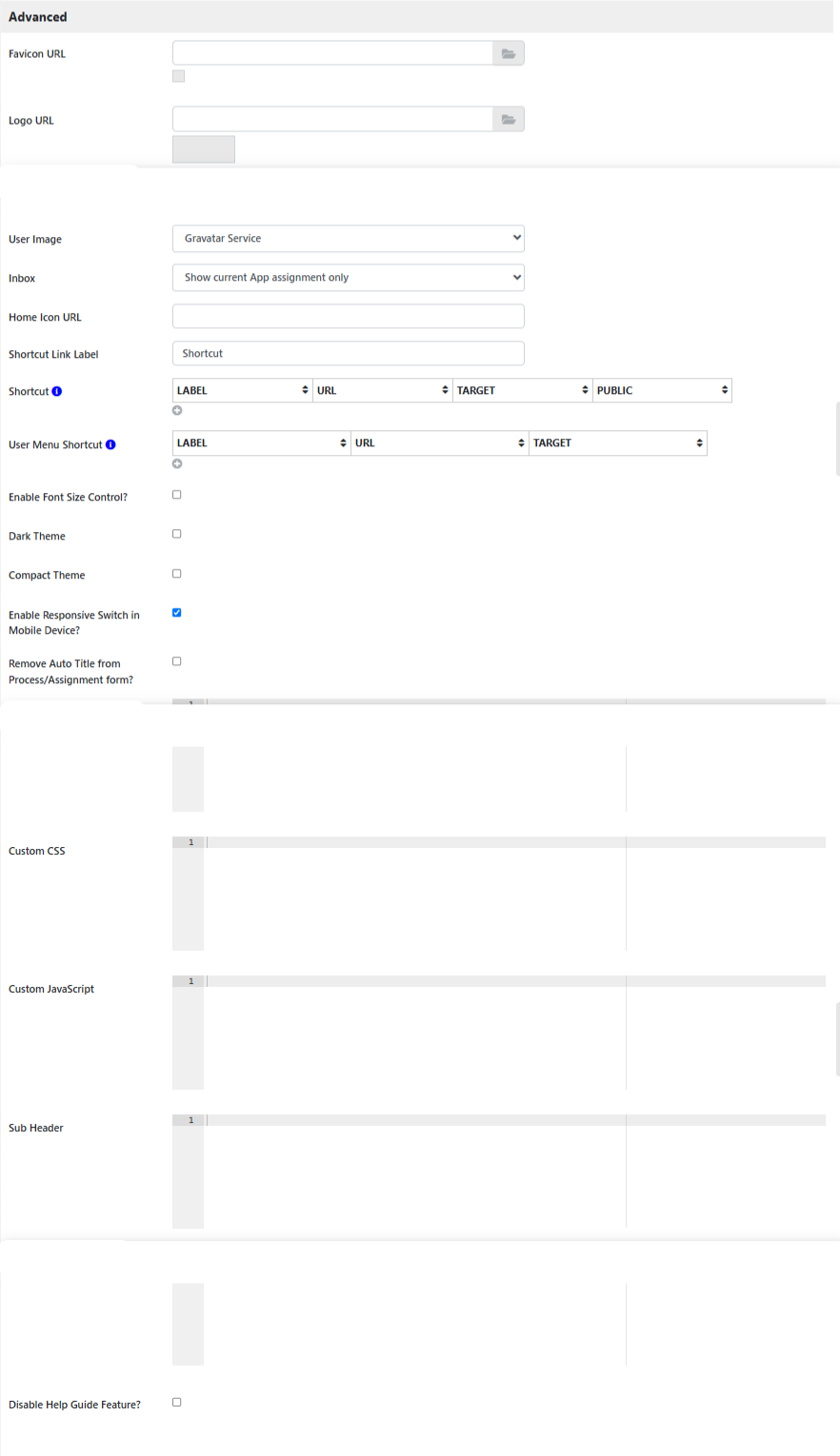
Fields to Configure:
- Favicon URL: Define the path to custom Favicon URL.
- Logo URL: Define the path to custom Logo URL.
- Disable Profile: Option to remove the user's profile photo display.
- User Image:
- Hide
- Gravatar Service
- Using Hash Variable
- Define Hash Variable To Retrieve User Image URL
- #form.user_profile.image[{currentUser.id}]#
- Inbox: Manage how assignments are displayed.
- No Inbox
- Show all assignments
- Show current App assignment only
- Home Icon URL: Home Icon URL address.
- Shortcut Link Label: Name for the shortcut link.
- Shortcut: Defines links to be parked under the Shortcut menu.
- User Menu Shortcut: Defines links to be parked under the User menu.
- Enable Font Size Control?: Check this to enable the ability to change the font size on UI runtime.
- Dark Theme: Check this to enable the dark theme.
- Compact theme: Provide features like Gmail density settings like Compact, Default & Comfortable. This setting will adjust the white space, padding & margin.
- Enable Responsive Switch in Mobile Device?: When checked, the Switch to the Desktop version link will be shown on the mobile device.
- Remove Auto Title from Process/Assignment form?: Process title and activity name will be removed from the assignment form when checked.
- Home Banner: Insert custom HTML for Home Banner
- Custom CSS: Add custom CSS to style the UI.
- Custom JavaScript: Add custom Javascript for the theme.
- Sub header: Insert HTML for a subheader.
- Sub footer: Insert HTML for a subfooter.
- Disable Help Guide Feature?: Click to hide the help guide feature.
Progressive web app (PWA) settings
The PWA settings ensure your application supports offline usage and push notifications. You can enable or disable PWA support and web push notifications and specify additional URLs to cache for offline functionality. These settings enhance the user experience by making the app more robust and accessible, even without an internet connection.
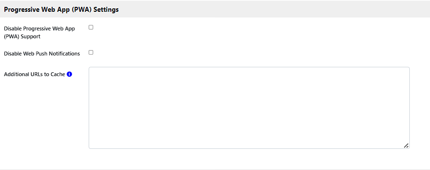
Fields to Configure:
- Disable Progressive Web App (PWA) Support:
Click the checkbox to disable PWA.
Joget DX apps automatically enable Progressive Web Apps (PWA) features in this theme so that all apps are PWA baseline compliant without requiring additional steps. These features include adding to the home screen, offline support, and push notifications. - Disable Web Push Notifications: Click to disable web push notifications in this user view.
- Additional URLs to Cache: Enter paths relative to the context root.
Login page UI
The Login Page UI settings allow you to customize your application's login page. You can upload a background image and add custom HTML content before and after the login form. These configurations help create a more engaging and personalized login experience for users and ensure that the login page aligns with your application's branding and design.
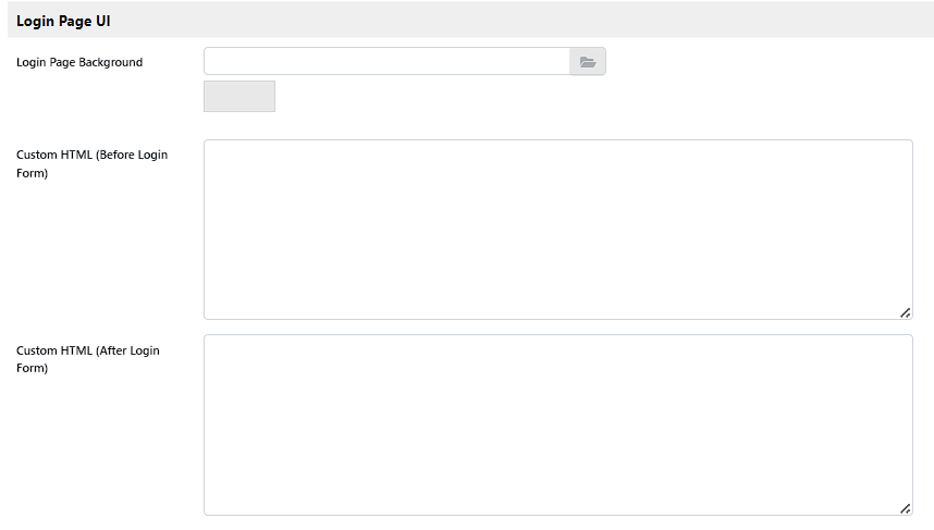
Fields to Configure:
- Login Page Background: Upload Login Page Background.
- Custom HTML (Before Login Form): Add custom HTML before the login form to include additional information or branding elements.
- Custom HTML (After Login Form): Add custom HTML after the login form to include additional information or branding elements.
Permission settings
Permission settings control who can access and see the UI in the App Center. You can hide the UI from the App Center listing, manage permission types, and temporarily disable permission checking for testing purposes. This ensures that only authorized users can access specific UI elements, maintaining security and appropriate access control.
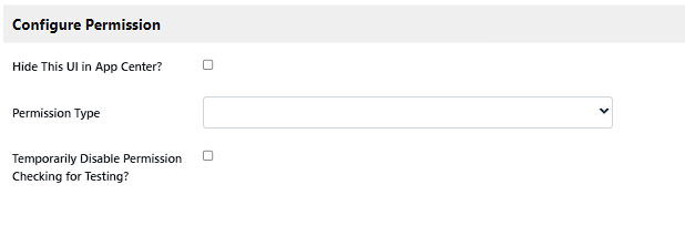
Fields to Configure:
- Hide this UI in App Center?: When checked, this UI will not be listed in the App Center.
- Permission Type: The white list to determine access to this UI.
- Temporary Disable Permission Checking: Click the checkbox to disable all category menu permission checking.